Notebook Ruling
How To Match Nib Width To Linespacing
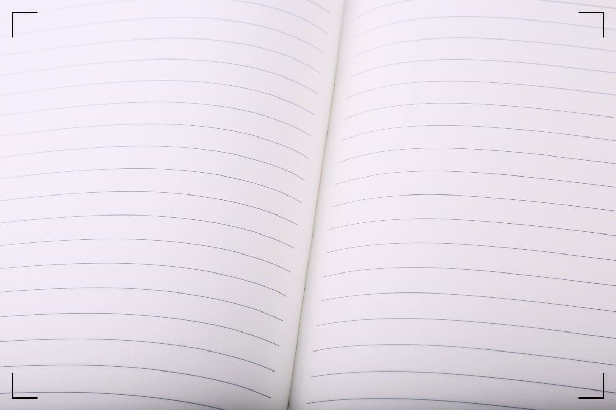
A notebook can look innocent until your pen hits the page and the whole thing goes sideways. Letters crowd each other, loops crash into the next line, and your notes start to look like a bar fight in slow motion.
That usually isn't your handwriting failing you. It's the nib width notebook ruling match going bad. Get that pair right, and the page opens up. Get it wrong, and even a fine pen can feel clumsy. Let's fix that.
Read the ruling before you blame the pen
Most people pick a nib by feel. Fair enough. Still, the notebook sets the trap.
A 5 mm grid gives you less room than 7 mm ruled paper. Dot grid can feel looser, because the dots don't boss you around the same way full lines do. French-style ruling and multi-line layouts give you more control, but they also punish a fat nib fast.
You don't need a ruler every time, but you do need a rough sense of space. If your notebook uses 6 mm or 7 mm lines, you can usually write comfortably with fine or dry medium nibs. If it uses 5 mm grid, you want tighter control. That's where extra-fine and fine nibs feel better.
Some rulings split the difference. Lamy's line-and-grid format lets you write large on the main lines or tuck smaller notes into the grid. Kokuyo's dotted rule does something similar, but with less visual noise. Both help when your writing size changes through the day, which it will, because you are human, not a machine.
If your lowercase letters keep touching the line above or below, the page is telling you the nib is too wide, the ruling is too tight, or both.
So start with the page. Then choose the nib.
A practical nib-width notebook ruling guide
Here's the quick reference that saves you from guesswork.
| Notebook ruling | Best nib range | What it feels like |
|---|---|---|
| 5 mm grid or narrow dot grid | Extra-fine to fine | Tight, neat, good for compact notes |
| 6 mm ruled or dotted rule | Fine to medium | Balanced, easy for daily writing |
| 7 mm ruled or wide grid | Fine, medium, some broad | Relaxed, open, easier for larger script |
| French ruling or multi-line layouts | Extra-fine to fine | Precise, great for disciplined handwriting |
That table gets you close. Then real life starts interfering.
First, nib sizes aren't universal. A Japanese fine is often narrower than a German fine. Many European nibs, including German and some Italian ones, run broader and wetter. So a Japanese medium might fit where a Western medium starts to crowd the page.
Next, nib shape changes the game. A stub nib throws a wide cross-stroke. An architect grind can look clean on one ruling and unruly on another. Broad nibs can work on wide ruling, but only if your handwriting has room to breathe.
Then there's your own style. If you print small, you can cheat upward. If you write looping cursive with tall ascenders, even a medium nib on 6 mm lines can start swinging elbows.
This is where people get fooled. They think they need prettier handwriting. Most of the time, they need a better fit.
If you use slim binders and movable pages, keeping a few pen tests together helps. A Plotter system as a creative inbox for nib notes works well for that, because you can archive old stuff instead of carrying dead weight.
Paper changes the line more than you think
Ruling is only half the job. Paper decides how wide the line looks after the nib leaves the scene.
Smooth papers like Rhodia and Clairefontaine keep edges sharp. They often show ink color well, too. The tradeoff is dry time. If you're left-handed, impatient, or both, that can turn a clean page into a smear report.
Midori MD tends to sit in a friendlier middle ground. It absorbs a bit more, so your line stays usable and dry times stay sane. That's why it's such a safe bet when you want one notebook for journaling, drafts, and daily lists.
Life Noble Note paper shows shading and sheen beautifully, with low bleed and little feathering, but it can take longer to dry. Tomoe River also keeps detail alive, though its thin pages can show more ghosting. A pencil board under the page helps keep the surface steady and control pressure marks. Beautiful, yes. Forgiving, not always.
Then you get toothier papers, like Leuchtturm, some Baron Fig books, and certain Lamy notebooks. They can feel tactile and satisfying, especially with pencils or drier pens. Yet with wet fountain pens, that same texture may feather a bit or make the nib seem broader than expected.
Japanese notebooks often get this balance right. Nakabayashi, Kokuyo, Midori, and Life each handle the problem a little differently. If you want more context on how that paper gets made, these Japanese notebook factory insights are worth your time.
So don't ask only, "What nib fits this ruling?" Ask, "What paper does this ruling live on?" That's the honest question.
Build a one-page test and trust your eyes
You don't need a spreadsheet. You need one honest page.
- Pick the notebook you plan to use.
- Write the same sentence with each nib and ink combo.
- Fill at least six lines, not one.
- Check spacing, dry time, feathering, and comfort.
Six lines matter because the first line lies. By line four, your hand relaxes. By line six, the truth shows up wearing muddy shoes.
If the letters choke the line spacing, step down a nib size. If the page looks pale and hesitant, step up. If a fine nib still spreads, switch ink or paper before you blame the pen.
Keep that test sheet with the notebook, or scan it and file it with your other writing references. Analog and digital don't need to fight. One catches the thought. The other helps you find it again when your memory decides to skip town.
The cleanest setup is the one you'll keep using.
A good match doesn't make your handwriting perfect. It makes the page stop resisting you. That's enough. More than enough.
So next time a notebook feels wrong, don't curse the pen first. Check the spacing, check the paper, and make the nib earn its place.
Conclusion, summary, key takeaways, links, download(s)
(Reserved for paying members)