Midori MD Versus Clairefontaine
Fountain Pen Ink Performance
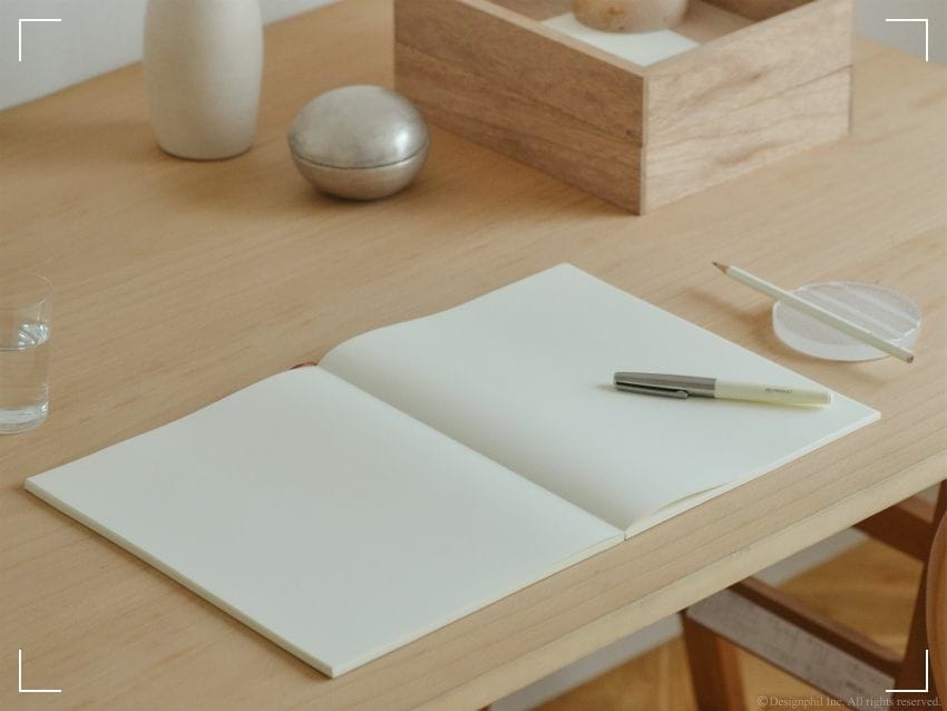
You learn fast that ink isn't the whole story. Paper is the other half of the alibi.
When you're comparing Midori MD and Clairefontaine paper, you're really contemplating what you want to see on the page: drama, shading, sheen, that slow-blooming pool of color? Or clean lines, fast dry times, and a surface that won't flinch when your hand moves too quickly?
Both brands have a reputation for being proper fountain pen paper. Still, they behave differently, like two witnesses telling the truth from different angles. Let's put them under the lamp.
What fountain pen ink needs from paper
And what it punishes
Fountain pen ink doesn't forgive sloppy paper. It spreads, it feathers, it ghosts through like a secret you didn't mean to share. The right sheet of paper keeps your lines sharp and your patience intact.
Start with two forces that always pull against each other:
Absorbency versus resistance. If paper drinks ink too fast, colors look flat and dry times improve, but shading and sheen can fade. If paper resists ink, your lines stay crisp, your ink looks richer, but dry time can stretch out like a bad night.
Then there's feel. Some paper is coated and slick, like a polished countertop. Others have a little tooth, a whisper of drag. That feel changes how a nib skates, how a medium steel nib talks back, and whether a broad nib turns into a paintbrush by accident.
And yes, that matters. If you like big wet feeds, you've probably flirted with Tomoe River paper before. That paper is famous for making ink look as if it's lit from within. It also teaches you the cost: longer dry times and a higher chance of smears when you rush.
If you want a wider context of paper choices beyond these two, JetPens keeps a solid overview in their guide to fountain pen friendly paper options. It helps you see where Midori and Clairefontaine sit in the lineup.
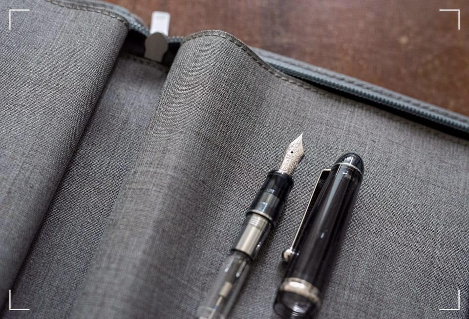
Midori MD paper
A little tooth, a lot of honesty
Midori MD paper feels like something made for long sessions. Not showy. Not cute. Just steady, like a notebook that expects you to come back tomorrow.
The surface has a controlled texture. You get feedback, not sandpaper. That matters when you're writing field notes after a photoshoot, hands still smelling like lens cloth and rain. With Midori MD, your pen doesn't hydroplane. It tracks.
Midori MD also tends to balance ink behavior in a way that feels practical. You still get shading and even sheen with the right ink, but dry times don't punish you as hard as ultra-slick papers can. That's why it plays well with pens that run wet, like an Opus 88 Omar or Flow, and with big-value ink haulers like the Asvine V800 and V200. You can throw a flexy mood at it, and it usually holds the line.
This is also why Midori MD fits so well in notebook systems. In a Traveller's Notebook (or Midori TN, if that's what you call it at 2 a.m.), MD refills keep the whole setup light and reliable.
If you want a deeper look at how Midori MD handles ink and how it's built, this Midori MD notebook review details the feel and ink performance.
Clairefontaine paper
Smooth control when speed matters
Clairefontaine is the clean shirt in your bag. It doesn't wrinkle. It doesn't panic. It just works.
The paper is famously smooth, often with a coated feel. For some writers, that's heaven. For others, it's too slick, when your nib can't seem to find traction. If you're coming from Midori's subtle tooth, the first page of Clairefontaine can feel like stepping onto ice in dress shoes.
Still, when you need clarity and consistency. And if you take out the heavy hitters, Clairefontaine handles them with calm. An Omas 360 Classic with a wet medium nib lays down a line that stays sharp. A Delta Dolcevita Oversized with a bold nib can be a firehose, yet the paper usually keeps feathering on a short leash.
Clairefontaine also plays nicely with the inks you use for work. Basic blues. Safe blacks. The stuff you trust when you don't want surprises. If you're the type to keep a Rhodia pad in the same drawer, you'll recognize the family resemblance. Rhodia often lands as the "default" recommendation because it's easy to find, but Clairefontaine is still the more controlled surface when you care about repeatable results.
Midori MD vs Clairefontaine
The choice you make in the dark
Here's a quick side-by-side, the kind you'd tape inside a notebook cover.
| What you care about | Midori MD | Clairefontaine |
|---|---|---|
| Writing feel | Light texture, steady feedback | Very smooth, low resistance |
| Ink look | Strong shading, can show sheen | Clean lines, less drama |
| Dry time | Medium, usually manageable | Faster, safer for quick notes |
| Feathering and bleed | Very low in normal use | Very low in normal use |
| Best use | Journals, travel notes, ink enjoyment | Work notes, speed, clean pages |
Midori MD favors the ink's character; Clairefontaine favors the writer's pace.
If your pen lineup runs expressive, you'll feel it fast. A Magna Carta Earth wants a page that lets it glow. A vintage-leaning Parker Duofold wants a sheet that doesn't turn its line into fuzz. Even budget beasts like the Wingsung 630 and Wingsung 930 can look suspiciously good when paper doesn't sabotage them. Meanwhile, a daily driver like a Lamy or a Sheaffer 300 often looks cleaner on Clairefontaine's smooth surface.
Your workflow matters too. If you're living out of a bag like a nomad, paper has to behave. If you're one of the analog nomads who scans everything later, you also want pages that photograph well and don't show heavy bleed-through. When you're back at the laptop, a simple capture routine (scan, name, tag, backup) feels less brutal when your notes are crisp.
Choose the paper that matches your speed. Then choose the ink that matches your mood. Don't swap those roles.
If you're still building your system, keep an eye on notebook systems like TN or Ro-Biki, because the cover you carry can change which paper makes sense.
For a reminder of why any of this still matters, and why the hand-made mark can hit harder than a typed line, read Esquire's piece on the lost art of writing by hand.
Conclusion, summary, key takeaways, links, download(s)
(Reserved for paying members)